
Tap Bonds: A Product Teardown
A page-by-page look at a bond research platform, and how I’d make it easier for every kind of investor to use.
Platform: Web (mobile app was in development at the time)
This teardown looks at the UI/UX, content, functionality and business strategy of Tap Bonds. I focused only on the web version, since the mobile app was under major development at the time. I went through every page on the website, and wherever it helped, added a quick wireframe or flowchart to show how I think it could be improved.
Mission: Empower investors with deep research and analytics for the bond market, making fixed-income investing more accessible and transparent.
01 / who uses tap bonds
Who uses Tap Bonds
Before getting into the changes, here are the kinds of people who are likely to use the website, and what gets in their way.

Rakhi Sharma, 22
Curious Beginner
Occupation: Recent graduate, working in her first job
Experience: None, new to investing
Goals: Wants to learn about investing, particularly bonds, but finds financial terms confusing
Pain points:
- Overwhelmed by financial jargon
- Unsure how bonds compare to stocks or mutual funds
- Struggles to evaluate which bond is safe or profitable

Rakesh Mehta, 45
Seasoned Investor
Occupation: Senior IT Manager
Experience: 15+ years in stocks, mutual funds and real estate; now exploring bonds for stability
Goals: Wants a diversified portfolio with bonds, and efficient tools to research them without reading lengthy reports
Pain points:
- Finds bond data scattered across multiple sources
- Needs quick, in-depth filtering on his own criteria (returns, maturity, credit rating, etc.)

Tamanna Kapoor, 35
Portfolio Manager
Occupation: Portfolio Manager at a financial advisory firm
Experience: 10+ years in wealth management
Goals: Needs in-depth, reliable bond data for clients, and efficient research tools to speed up investment decisions
Pain points:
- Needs bulk analysis tools for evaluating multiple bonds at once
- Requires customised reports to present findings to clients
02 / critical issues
Critical issues
Not every finding below carries the same weight. Two things on this list aren’t cosmetic, they’re the kind of bug that costs the business money or trust if left alone. I’m surfacing them here first, instead of letting them sit buried in a nine-page walkthrough.
The AI Generated Summary quotes stale financial data
On the Bond Screener, the AI summary pulls EPS, Current Ratio and Debt-to-Equity from March 2023, while the Key Metrics tab on the same page already shows March 2024 figures. A user who trusts the AI feature, which is the entire pitch of adding it, is making a bond decision on numbers a year out of date, with the correction sitting one tab away.
Risk: Trust and decision quality. This isn’t a UI nit, it’s a flagship feature actively contradicting its own product.
Fix: Pipe the AI summary from the same data source as Key Metrics, or disable the AI summary until it can be.
The “Talk to an Expert” confirm button is invisible at 100% zoom
This is Tap Bonds’s conversion path into a paid, human-assisted service, and most users never zoom out to 80% to go looking for a button they don’t know is missing.
Risk: Direct revenue leak on a lead-generation flow.
Fix: A CSS layout bug. Should be a same-day fix.
Findings at a glance
The full list, triaged by severity and tied to the business risk and persona each one actually affects, rather than treating every finding as equally important.
| Finding | Severity | Business risk | Persona | Fix effort |
|---|---|---|---|---|
| AI summary shows stale (2023) data vs. Key Metrics’ current data | Critical | Trust / decision quality | Rakesh, Tamanna | Low–Med |
| “Talk to an Expert” CTA invisible at 100% zoom | High | Revenue (lead-gen) | All | Low |
| Bond Finder (weekly) vs. Bonds Directory (daily) refresh mismatch | High | Trust / decision quality | Rakesh, Tamanna | Investigate |
| OTP required at every sign-in | High | Activation / retention | Rakhi | Medium |
| 1 Minute News shows stale stories first | Medium-High | Trust (feature’s premise is freshness) | All | Low–Med |
| No tooltip on Bond Finder column headers | Medium | Activation (beginners can’t use the tool) | Rakhi | Low |
| Finance Wiki filters push glossary below the fold | Medium | Activation / education | Rakhi | Low |
| Pros & Cons text breaks mid-sentence across bullets | Low-Medium | Perceived credibility | Tamanna | Low |
| WhatsApp opt-in pre-ticked by default | Medium | Trust / compliance optics | All | Low |
| Blog categories missing from main blog page | Low-Medium | Content discovery | All | Low |
| Duplicate ISIN / issuer name in bond detail header | Low | Cosmetic | — | Low |
| Duplicate “Bonds Directory” label | Low | Cosmetic | — | Low |
| Redundant chevrons in Tools dropdown | Low | Cosmetic | — | Low |
| Overlapping logos in Bond Finder at certain zoom | Low | Cosmetic | — | Low |
03 / the landscape
The landscape
Some notable companies operating in the Indian fintech space:
| Company | Insights on bonds | Bond investment platform |
|---|---|---|
| Stable Money | Yes | Yes |
| Navi | — | — |
| Groww | — | — |
| INDmoney | Yes | Yes |
| Moneycontrol | Yes | — |
| The Economic Times | Yes | — |
| TradingView | — | — |
| Tap Invest | Yes | Yes |
| Tap Bonds | Yes | — |
04 / page walkthrough
1. Onboarding
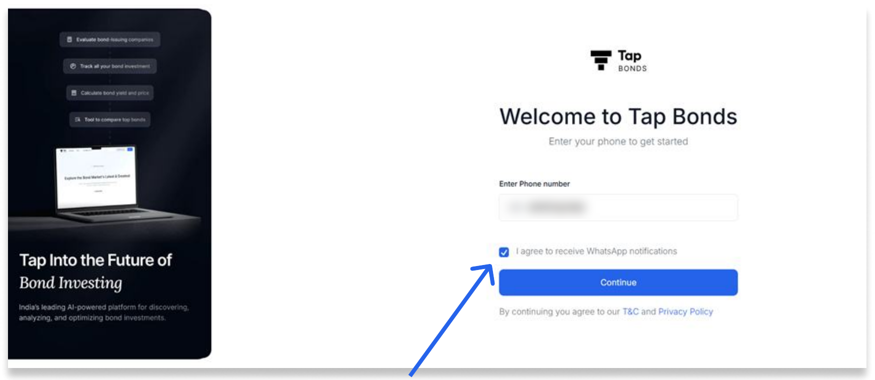
Sign-in is smooth, but having to log in with an OTP every single time gets frustrating. I had to log in three times within two days.
Fix: Introduce Google sign-in so users stay logged in. If phone number stays the norm, add a username and password option to make returning easier.
At every sign-in, the WhatsApp notifications box is ticked by default, which can read as a marketing tactic. It would be friendlier and more transparent to remember the user’s previous choice.
2. Navigation bar
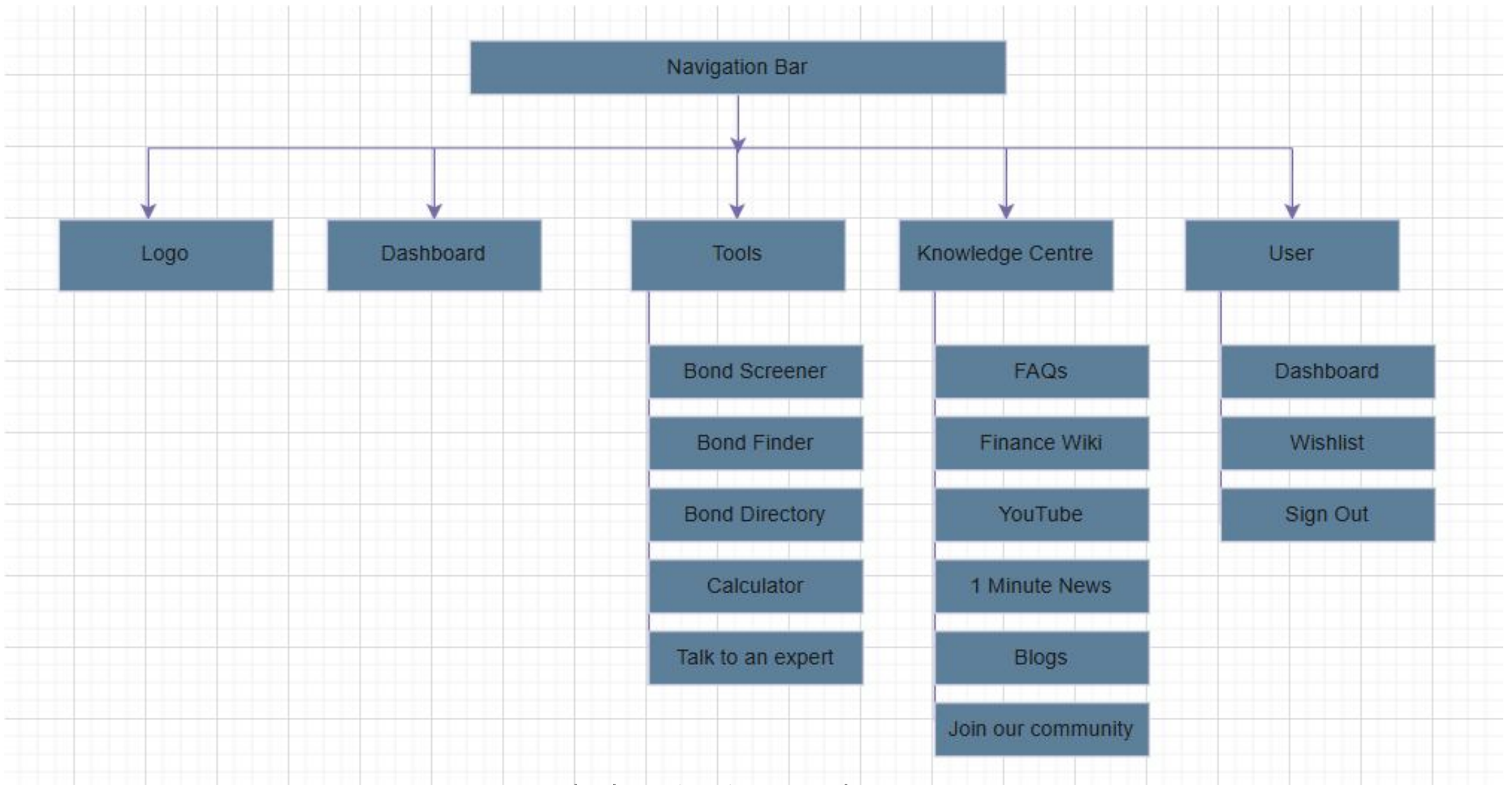
The arrow icons next to Tools and Knowledge Centre make sense, since both open a dropdown on hover. But the arrows beside every tool inside the dropdown aren’t needed. Hovering already changes the box from white to light blue, so the arrows are repetitive and suggest there’s another dropdown when there isn’t.
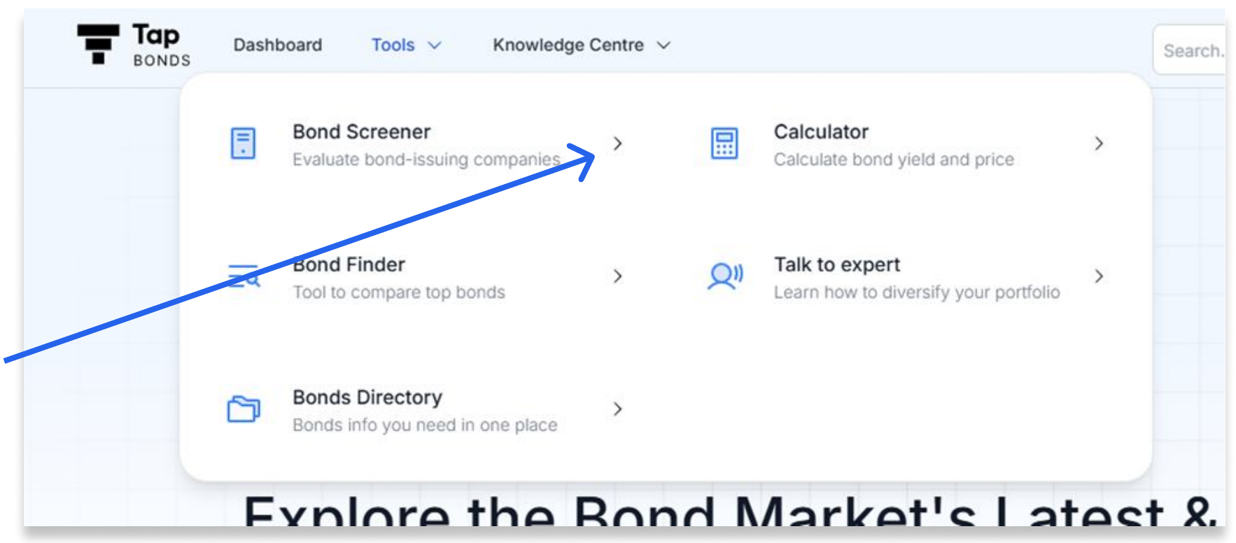

What’s New and Search feel out of place. Dashboard is already on the nav bar, and the community link is already in Knowledge Centre.
Dashboard could also live under the profile menu, alongside Wishlist and Logout, as well as on the nav bar.
And since we’re looking at community: why not Telegram or Slack?
3. Tools → Bond Finder
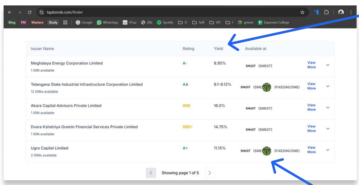
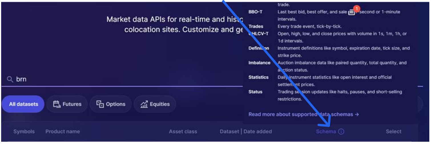
A lot of Tap Bonds users are new to investing too. It’s good practice to give them a basic idea of what each column header means, and a simple hover tooltip does the job (see databento.com).
An open question from the FAQ: Why is Bond Finder updated weekly when Bonds Directory updates daily at 2 AM? Doesn’t a weekly refresh affect investor choices, or is daily updating planned for later?
My hypothesis: Bond Finder likely pulls from a third-party data vendor, priced or rate-limited per refresh, while Bonds Directory may run on an internally-maintained feed that’s cheaper to update. If that’s right, the fix isn’t necessarily “make Bond Finder daily too,” vendor economics may not allow it. The actual fix is to visibly timestamp Bond Finder’s “last updated” so an investor comparing it against Bonds Directory’s same-day data knows which one they’re looking at. The real risk here isn’t the refresh cadence, it’s two tools in the same product silently disagreeing with each other.
After clicking on an instrument

The issuer name and ISIN appear twice in a row. Here’s a cleaner version:
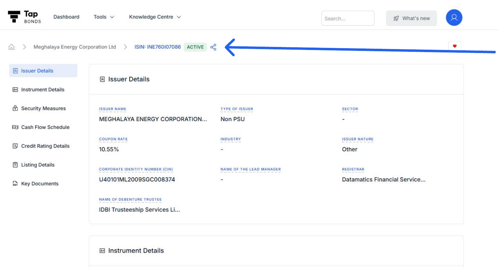
No data is lost. The ISIN in the breadcrumb can carry the link that used to sit on the removed header.
4. Tools → Bond Screener
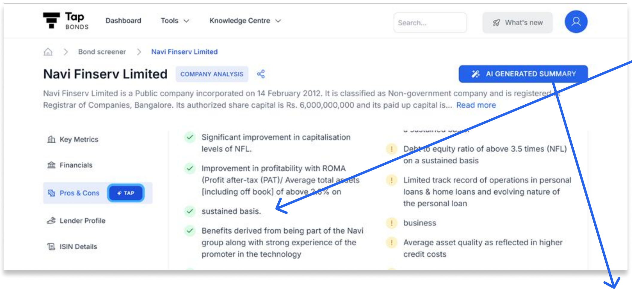
The Pros & Cons content isn’t parsed into bullets correctly, so sentences break across separate points.
Clicking AI Generated Summary opens this:

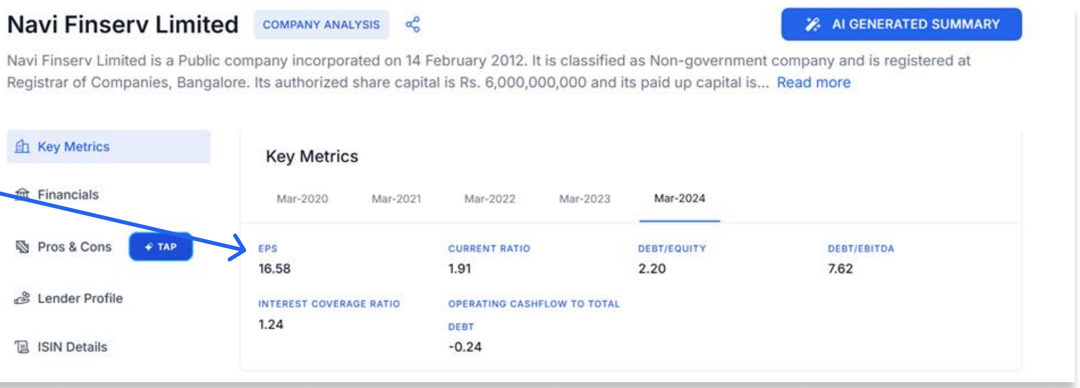
Compare EPS and Current Ratio in the AI summary with the Key Metrics tab: the AI data is out of date.
So what’s the point of the AI summary, when everything in it is already on the page, in a much better format?
5. Tools → Bonds Directory
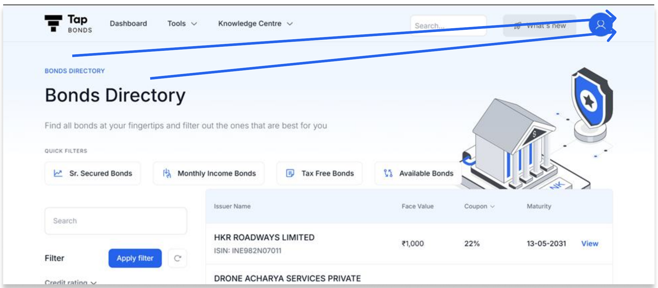
“Bonds Directory” is written twice, once as a small label and once as the heading. The upper label can go.
6. Tools → Talk to an Expert
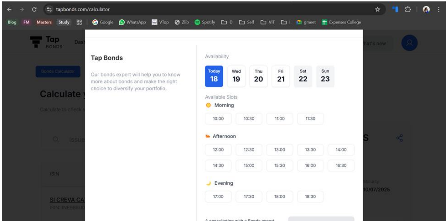
At 100% zoom, the button to book a consultation isn’t visible. I had to zoom out to 80% to find it.
7. Knowledge Centre → Finance Wiki
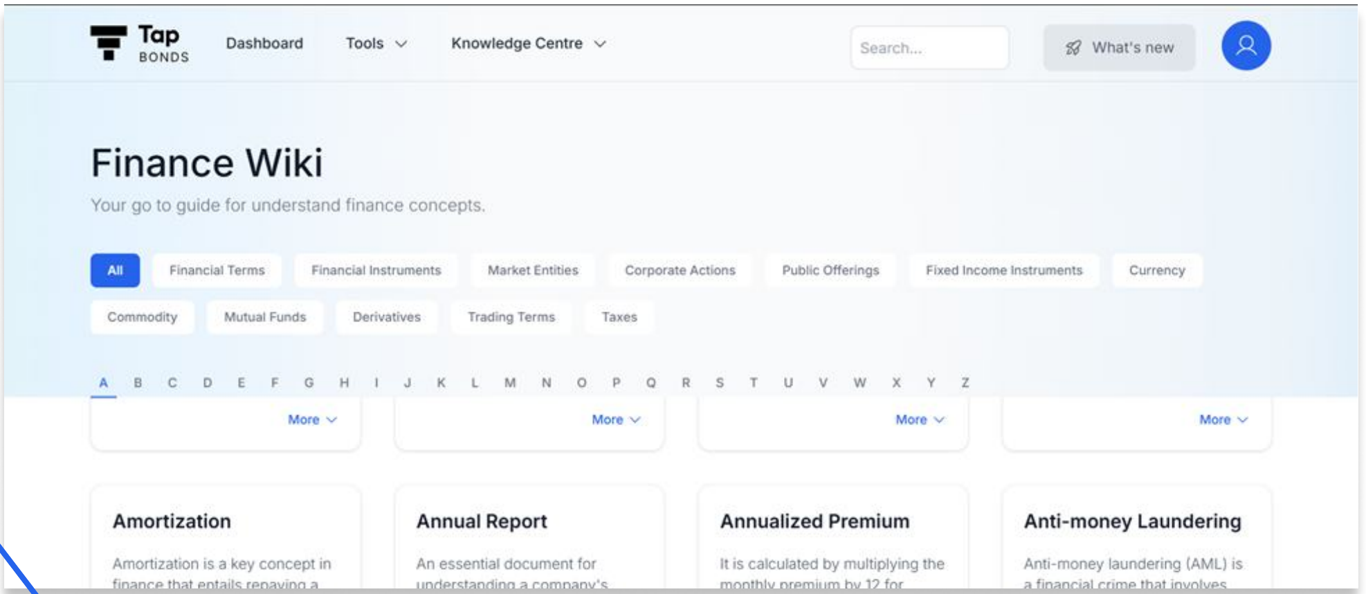
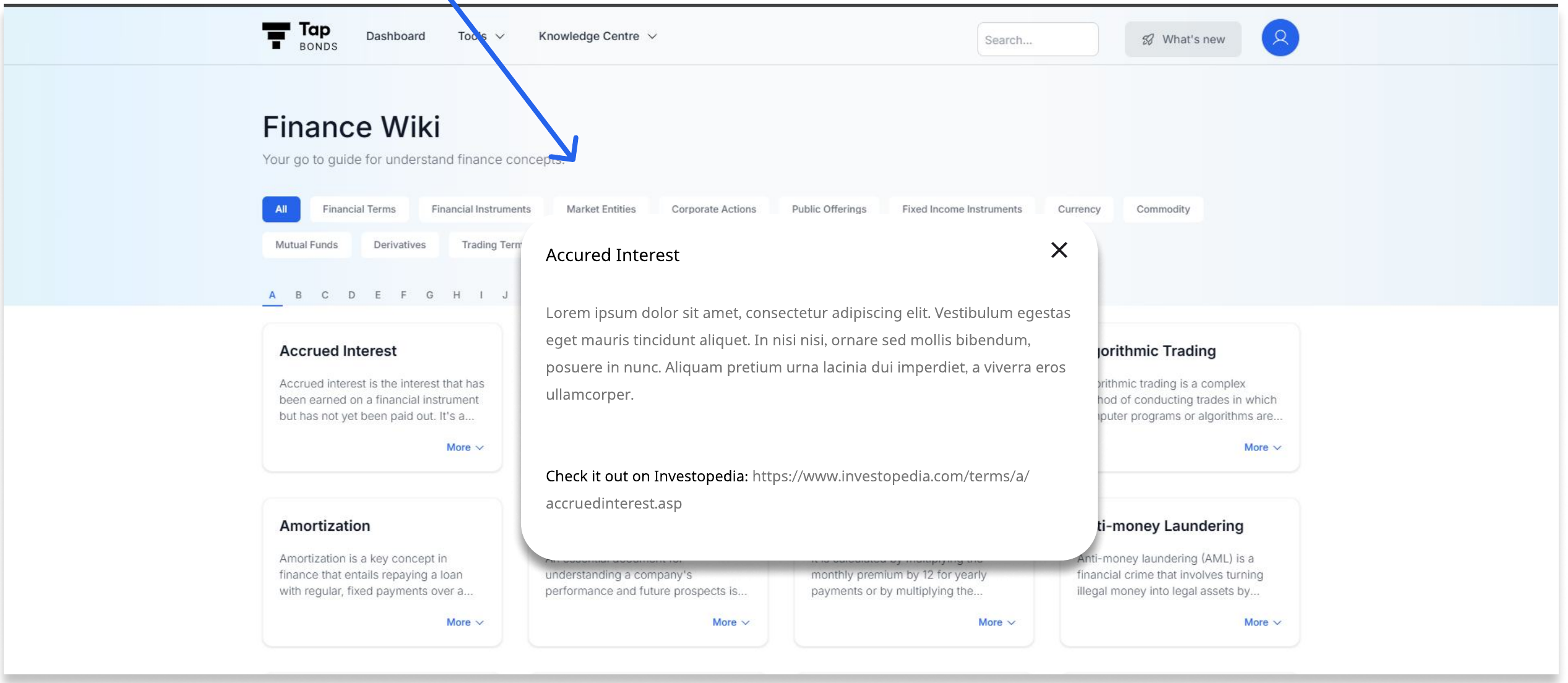
At 100% zoom, the glossary is hard to read because the filters take up most of the space.
Fix: Let individual cards pop out when clicked.
8. Knowledge Centre → Blogs
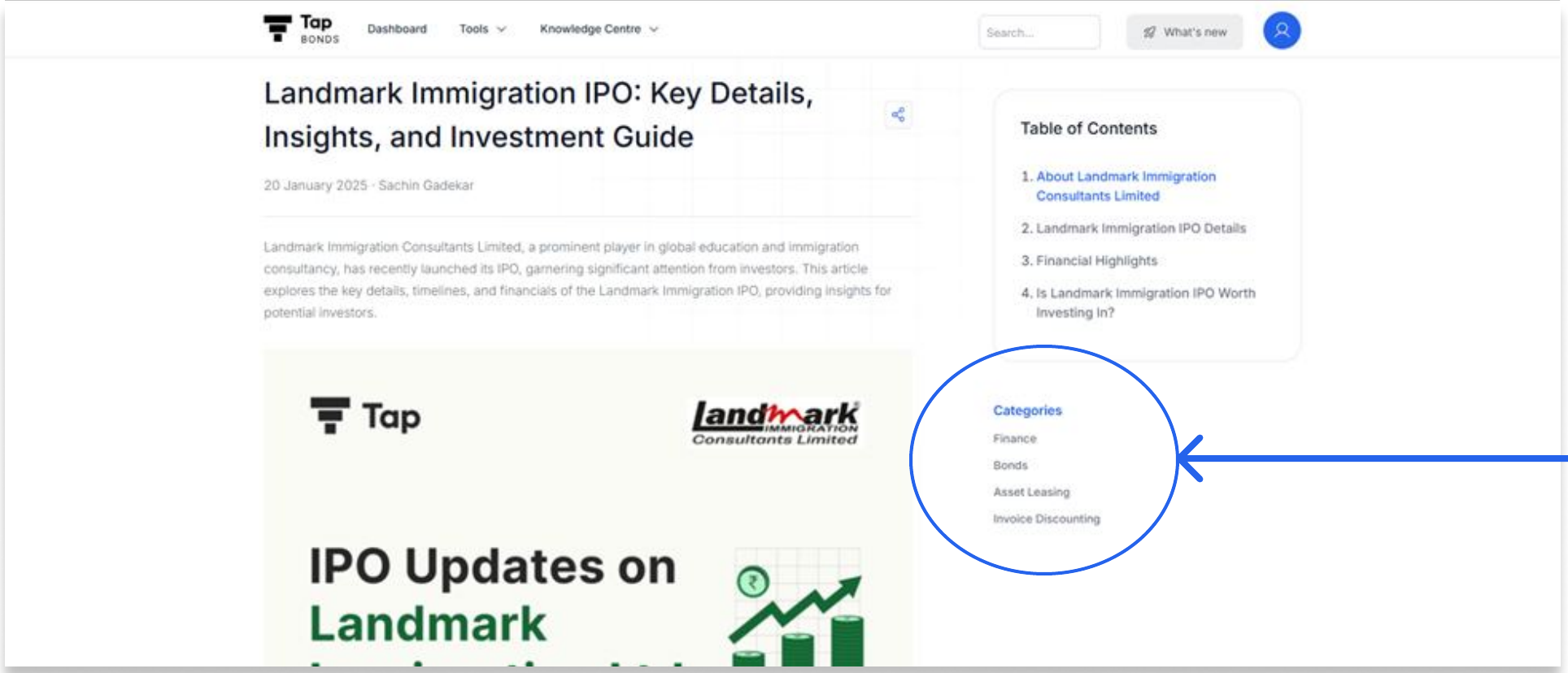
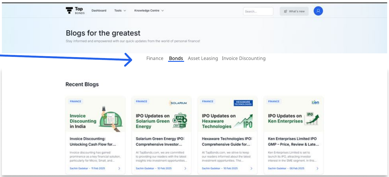
The categories only show up on individual blog posts. They should also be on the main blog page, so readers can pick the topics they care about.
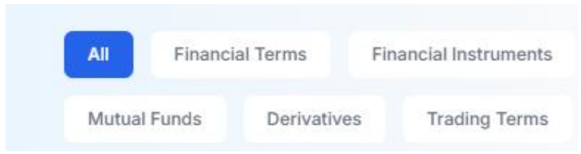
This is just one example of how the filters could look. For design consistency, they could also follow the keyword chips already used on the Finance Wiki:
9. Knowledge Centre → 1 Minute News
The latest pieces don’t show up first. 18 February was the newest piece on the news page, but it wasn’t reflected on the homepage or in Knowledge Centre → 1 Minute News.
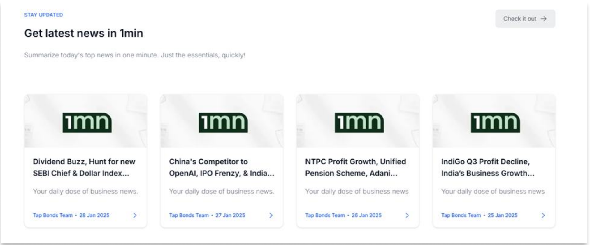
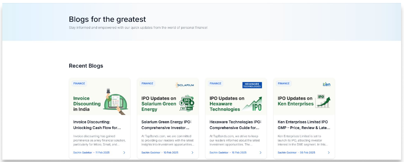
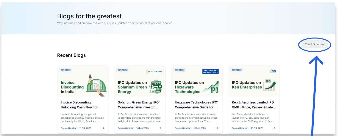
Instead of pagination, a single button can link to the full 1 Minute News page, with the latest story always on the first card. Ideally this page isn’t needed at all, and users can go straight to 1minutenews.substack.com.
05 / business strategy
Business strategy
If Tap Bonds eventually lets people invest on the platform, its competition is:
If Tap Bonds stays a research-first platform, its competition is:
Assumption: Tap Bonds wants to stay a research-oriented platform rather than become an investing platform.
That means it can focus on:
- Deeper analytical focus: a data-driven approach without pushing transactions.
- Trust and independence: users may trust the insights more because the platform isn’t tied to investment commissions.
- Flexible monetisation: reports, subscriptions or partnerships instead of transaction fees, priced for the Indian market.
Risks
- Competition: established players already cover equity and mutual funds as well as bonds.
- International coverage: Tap Bonds only covers the Indian market, while several of these companies have already expanded internationally.
- Mobile app: it’s always easier to browse markets on a phone, and Tap Bonds doesn’t have an app yet.
06 / recommendations
Where I’d focus
Rather than an unranked list of ideas, this is a roadmap: severity and effort decide what ships first, and what gets batched into cleanup.
Fix now
High severity, low effort
- AI summary data mismatch
- “Talk to an Expert” button visibility
- Timestamp Bond Finder’s refresh cadence
Next quarter
High severity, more effort
- Google sign-in to kill repeat OTP friction
- Column-header tooltips and Finance Wiki fold fix (both unblock the beginner persona)
- Fix 1 Minute News freshness ordering
Batch into one UI cleanup sprint
Low severity, low effort each
- Duplicate labels, redundant chevrons, overlapping logos
- Pre-ticked WhatsApp checkbox
- Blog categories on the main blog page
Strategic
On top of the fixes above, the research-platform-vs-investing-platform fork, monetisation directions and competitive risk covered in Business strategy are the longer-horizon bets, worth revisiting once the roadmap above is clear.